What font does Facebook use? This question may come to mind as you scroll through your newsfeed or engage with posts. As one of the most recognizable platforms, Facebook’s typography is a crucial part of its branding and user experience. The font it uses has evolved over the years, but the current selection is a clean, modern typeface that aligns with Facebook’s minimalist and user-friendly design. In this article, we’ll break down the font choices made by Facebook, why they matter, and how they impact the way we interact with the platform.
Let’s explore the history of Facebook’s fonts, the specific font used on the website and mobile app, and the thought process behind these typography decisions.
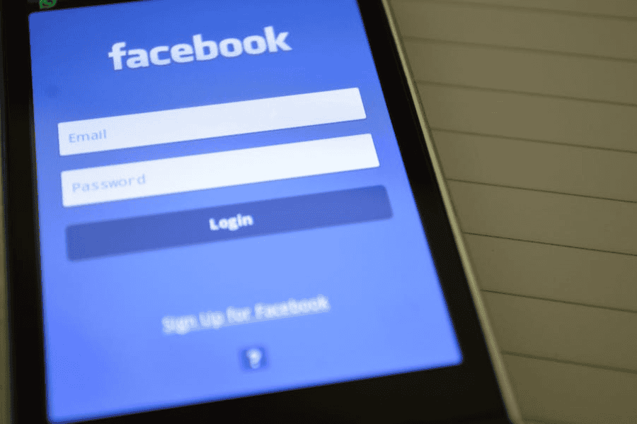
What Font Does Facebook Use? The Primary Typeface Explained
Facebook uses different fonts across its platforms, but its most recognizable typeface is Helvetica Neue. Helvetica Neue is widely used across Facebook’s mobile apps and interfaces. Known for its clean and simple appearance, this sans-serif font is a perfect match for Facebook’s design philosophy, focusing on clarity and ease of reading.
In the past, Facebook experimented with different fonts, but it has settled on Helvetica Neue because of its versatility. Whether you are using Facebook on a mobile device or desktop, the font ensures consistency across all formats, giving users a seamless experience.
Facebook’s Font on Desktop: Segoe UI
While Helvetica Neue is dominant on mobile apps, Segoe UI is primarily used on Facebook’s desktop version. Segoe UI, developed by Microsoft, is another sans-serif font that promotes readability and modern design. It is the default font for many Windows applications, which is why Facebook chose it for its web-based platform, providing users with a familiar and visually comfortable experience.
The Facebook Logo Font: Klavika
Facebook’s logo is one of the most iconic symbols on the internet. The original font for the Facebook logo was Klavika, a bold, square-shaped sans-serif typeface designed by Eric Olson. When Facebook first launched, this font helped establish its brand identity, giving it a strong, clean, and tech-forward look.
However, in 2015, Facebook slightly altered its logo. The company softened the font’s edges and removed the sharp angles, making it more approachable and user-friendly. The revised font is a custom variation of Klavika, created specifically for Facebook. While the changes were subtle, they reflect Facebook’s shift towards a more community-centered, less corporate feel.
Why Fonts Matter: The Impact of Typography on Branding
Typography is much more than just a design choice; it’s a key element of branding. The fonts Facebook uses have a direct impact on how users perceive the platform. Here’s why fonts like Helvetica Neue and Segoe UI work so well for Facebook:
1. Readability and Clarity
Facebook’s primary function is to connect people through written posts, comments, and messages. The fonts they use, particularly Helvetica Neue and Segoe UI, are designed for readability. These sans-serif fonts offer clean lines and a neutral style, making them ideal for long hours of reading and scrolling.
2. Consistency Across Platforms
Whether you’re browsing on your smartphone, tablet, or desktop, Facebook maintains a consistent look and feel. This consistency is largely achieved through typography. By sticking to fonts like Helvetica Neue on mobile and Segoe UI on desktop, Facebook ensures that its user interface remains uniform across all devices.
3. Modern and Minimalist Design
Both Helvetica Neue and Segoe UI are modern, minimalist fonts. They reflect the clean and simple design philosophy that Facebook follows. Facebook is all about usability, and these fonts play a crucial role in keeping the interface clutter-free and easy to navigate.
The Evolution of Facebook’s Fonts Over Time
Facebook’s font choices have changed since the platform first launched in 2004. Initially, Facebook’s website used common system fonts, but as the platform grew, it shifted to more custom, modern typography to match its evolving brand identity.
Here’s a quick timeline of how Facebook’s fonts have evolved:
Early Years (2004-2010)
In its early years, Facebook used standard system fonts like Tahoma and Verdana. These fonts were commonly used in web design at the time because they were widely available on most computers. Tahoma, in particular, offered decent readability but lacked the sleek, modern look Facebook wanted to achieve as it grew.
2010-2015: Introducing Helvetica Neue
As Facebook expanded, it introduced Helvetica Neue as the primary font for its mobile apps and user interfaces. This marked a shift towards a cleaner, more modern design that reflected Facebook’s growing influence in the tech world. Helvetica Neue became the go-to font, representing Facebook’s desire to offer a sleek and functional user experience.
2015-Present: Refined Logo and Custom Fonts
In 2015, Facebook introduced a new version of its logo, moving away from the sharp lines of Klavika to a custom, more user-friendly font. The company also continued to use Helvetica Neue and Segoe UI across its platforms, maintaining consistency and readability for its growing global user base.
How Facebook’s Fonts Enhance User Experience
Fonts play a significant role in shaping the user experience on digital platforms. Facebook, with billions of users worldwide, carefully selects its typography to create an accessible, easy-to-use interface. Here’s how fonts improve the overall experience:
1. Cross-Platform Compatibility
Since Facebook is accessed on various devices—mobile phones, tablets, and computers—the font needs to be compatible across different screen sizes and resolutions. Helvetica Neue and Segoe UI perform exceptionally well in this regard, ensuring that the text is clear and legible no matter the device or resolution.
2. Simple and Neutral Aesthetic
One of the reasons Facebook uses sans-serif fonts like Helvetica Neue is because of their neutral aesthetic. These fonts don’t draw too much attention to themselves, allowing the content (photos, posts, videos) to take center stage. The fonts are simple, clean, and easy to digest, which complements Facebook’s mission of being a platform for communication and connection.
3. Scalability
Fonts on social media platforms need to be scalable. Whether a user is looking at text on a large computer screen or a small phone, the font must retain its readability. Both Helvetica Neue and Segoe UI scale well without losing their clarity, which is crucial for Facebook’s design.
The Future of Facebook’s Fonts
As Facebook continues to grow and evolve, its typography will likely adapt along with it. While Helvetica Neue and Segoe UI are staples for now, Facebook may develop more custom fonts in the future as the platform expands into new areas like virtual reality (VR) and augmented reality (AR).
In the future, Facebook’s typography may lean more towards a personalized, dynamic font system that adapts based on user preferences, screen types, or even regional languages. But for now, Helvetica Neue and Segoe UI remain the defining fonts of Facebook’s user interface and brand.
How to Incorporate Facebook’s Font Style in Your Projects
If you love Facebook’s clean and minimalistic font choices, you can incorporate similar styles into your projects. Here are some ways you can apply Facebook’s typography style:
1. Use Helvetica Neue for Modern Web Design
If you’re designing a website or mobile app, consider using Helvetica Neue for a modern, sleek look. Its simple and neutral design makes it ideal for websites that need to emphasize clarity and usability.
2. Segoe UI for Microsoft-Based Platforms
If you’re creating content for a Microsoft-based environment (such as Windows apps or websites optimized for Microsoft browsers), Segoe UI is a great choice. It’s clear, professional, and widely used in Windows applications.
3. Create a Custom Logo Font
Take inspiration from Facebook’s custom logo font by creating a unique font for your brand. Whether you choose a sans-serif font or something more elaborate, a custom logo can help establish your brand identity and make your business stand out. You can even try using a Facebook Font generator to create a logo with a similar look.
Final Words
So, what font does Facebook use? Across its platforms, Facebook uses Helvetica Neue for mobile apps and Segoe UI for its desktop version. The iconic logo uses a custom variation of Klavika, representing the social media giant’s evolving brand identity. These fonts are clean, modern, and highly readable, contributing to Facebook’s seamless user experience.
Whether you’re browsing on your phone or computer, Facebook’s choice of fonts ensures that the platform is accessible and easy to navigate. By using fonts that prioritize clarity and functionality, Facebook continues to offer a user-friendly environment for its billions of users worldwide.
FAQs
1. What font does Facebook use on its mobile app?
Facebook uses Helvetica Neue on its mobile app, offering a clean and modern look that enhances readability.
2. What font is used in the Facebook logo?
The Facebook logo originally used Klavika, but in 2015 it was updated to a custom font based on Klavika, giving the logo a more approachable feel.
3. Why does Facebook use Helvetica Neue?
Facebook uses Helvetica Neue because it’s a clean, neutral font that is easy to read on both small and large screens. It ensures a consistent and accessible user experience.
4. What is the difference between Facebook’s mobile and desktop fonts?
On mobile, Facebook uses Helvetica Neue, while on the desktop version, it uses Segoe UI. Both fonts are sans-serif and focus on clarity, but Segoe UI is optimized for desktop and Windows platforms.
5. Can I use Facebook’s fonts in my design projects?
While you can’t use Facebook’s exact custom fonts, you can use Helvetica Neue and Segoe UI in your design projects to achieve a clean, modern look similar to Facebook’s design style.