We will define the term “What is color grading in photography?” But as a photographer, photo editor, or graphic designer, being able to color-grade photos is an important skill you should develop.
The movie industry has also been using color grading since film production started. It is used to set the atmosphere and visual tone of the footage.
You can use color grading to make footage cinematic. Photographers use it to change or enhance the color of their photos to portray a certain mood or feeling.
Here, we’ll explain color grading, the difference between color grading and correction, and how to color grade. However, if you need help color-grading your footage or photos, Designyep, a photo editing agency, is a wise choice.
Alright, let’s get back to business.
What Is Color Grading in Photography?
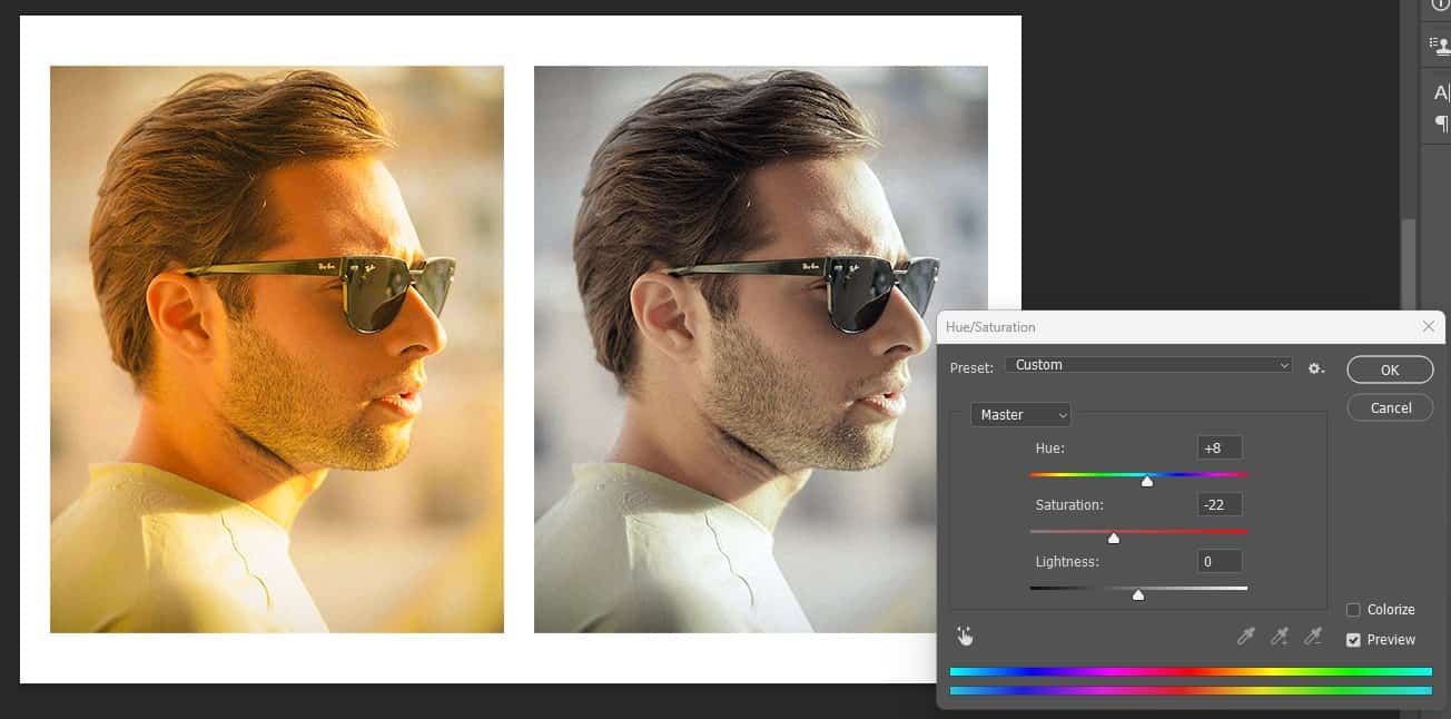
The photo above has been color-graded. One has been enhanced, and it’s obvious. That is what color grading seeks to achieve.
So, if you ask me to define the term “What is color grading in photography, the answer would be “a technique used in manipulating a photo’s color tone to create a desired mood.”
Photo editors use color grading to create a coherent sensibility or mood with the color palette. However, I wish to correct a misconception: color correction isn’t color grading.
Both are techniques deployed to enhance the quality of photos but produce different results. So, if you encounter anyone using term color correction and color grading interchangeably, let them know both are different.
Here, we will discuss the difference between color grading and color correction.
Color correction isn’t color grading. The color correction procedure enhances images, making them look exactly how they appear.
On the other hand, color grading conveys a unique visual tone. You must tweak different elements to achieve a more artistic and cohesive color grade for your images.
Is Color Grading Used In Video Editing?
Color grading was popularly used in video editing to make footage cinematic. But things have changed and are still changing.
People used to associate color grading with video editing in the past. But as the gaps between video content and stills started closing, color grading started becoming more relevant to photographers.
A Handy Tip: Let me explain a simple term to make this post easier to digest. Photo editing is in two categories. In other words, it’s divided into two stages. The first one is “color correction,” or you can call it the “correction stage.”
In the correction stage, photo editors fine-tune exposure, fix white balance, crop, and perform other necessary tweaks to enhance the image. But the job is unfinished at this stage.
The next stage of photo editing is the creative stage. And this is where you need “color grading.” Color grading will be valuable in this stage to transform the atmosphere and mood to what the editor wants.
You can create a sunny vibe or feeling such as warmth, coldness, somberness, etc. You can transform your image in any direction you desire.
Software Used For Color Grading
What are the programs or software used for color grading? Check them out below:
Adobe Photoshop: This is a powerful tool for various photo editing projects. You can use it to replace colors, match colors between multiple images, and adjust your subjects’ saturation (also hue).
DaVinci Resolve: DaVinci is a popular name in the photo editing world. You can use this tool to perform numerous tasks. It boasts advanced color grading controls. DaVinci Resolve is a curve editor and can perform primary color correction satisfactorily.
Adobe Lightroom: Lightroom is another popular and widely used photo editing tool. Later in this post, we will also perform color grading using this tool. The unique thing about the Adobe Lightroom is that it boasts easy-to-use color controls.
Adobe Premier Pro: Here is another tool you’ll find helpful when grading color. It features a Lumetri Color panel, allowing users to color grade via manual adjustments and presets.
Lightworks: This nonlinear photo editing system is valuable for enhancing the richness of colors in images and videos. It is a free tool and has been around for quite a while, though it didn’t get the traction it deserves.
Final Cut Pro: Like Lightwork, Final Cut Pro isn’t as feature-rich and advanced as Adobe, but it can offer some value when used for color correction. Apple developed this tool.
After Effect: You can use this tool to manipulate the color of your footage.
Wondershare Filmora: Filmora is a unique color grading tool. It has diverse features that make color grading a breeze.
Is Color Grading Important?
Yes, it is. Color grading is vital in photography. Filmmakers also use it to enhance the appeal of their footage.
Now, most people would want to know why color grading is vital. Here is what you should know.
With color grading, you can adjust the colors and appeal of your images. It lets you create your desired atmosphere and mood.
As a photo editor, I treat color grading as “painting.” Why? The editor can choose the colors and shades needed to create a desired effect or outcome.
Photo editors perform color grading on images to enhance their visual appeal and create the desired feeling. So, with color grading, you can tweak your photos so their visual impact becomes strong enough to capture attention.
Additionally, people will desire to view your photos. The mood or feeling you’re trying to create will be obvious enough to the viewers.
Color grading is vital in photography. You can use it to transform any photo and create the mood you want your viewers to be in when viewing your photos.
You can use this photo editing technique to improve the colors of landscape images, making foliage greener and the sky more vibrant. You can even use color grading to make your photos more vintage and warm.
The Different Terminologies Used In Color Grading Explained
Color grading in photography is about more than just tweaking the colors of photos. This technique boasts several vocabularies you need to know.
You already know you need to understand these vocabularies before delving into photo editing, with a focus on color grading. You will find the tool simple enough to understand.
So, without much ado, here are the terms you need to know in color grading.
1: Saturation: This feature refers to the color intensity. In other words, it focuses on the intensity of the photo’s color.
Changing the “saturation” on the tool to “zero” means no color will be left in your photo. In other words, your photo will become black and white.
2: Hue: Hue refers to the main properties of color without intensity or brightness. In other words, it refers to the purest form of color.
3: Value: This feature has different names, depending on your program. It is sometimes called “Luma,” “Brightness” or “Lightness.” Value deals with how dark or light the color of the photo is.
On the photo editing tool, you’ll find several features. You can use these features or tools to tweak your photo and improve its color.
So, the next features aren’t vocabulary words. Instead, they are valuable features of the photo editing tool and are essential for color grading.
4: Brightness and contrast: Do you want your image to be darker or lighter? If yes, adjust the brightness and contrast.
A Handy Tip: The brightness and contrast are together. In other words, you cannot edit one and leave the other. If you adjust the brightness, it will affect the contrast and vice versa.
Brightness refers to your photo’s overall lightness and darkness. On the other hand, “contrast” refers to the photo’s relative lightness and darkness.
So, a higher contrast means your photo will have lighter light and darker dark.
5: White balance: This lets you determine how warm or cool you want your image to be. Blue-toned is the appearance of the cooler image, while sepia or reddish tones are for warm photo appeal.
6: Curve: This feature lets you tweak the entire brightness of your photos. You can also work on the individual colors to enhance the quality of your photos. You can adjust the colors, such as red, green, and blue, making the photo more appealing.
7: Color match: This tool will help you analyze the color of your reference image and match your image to it. It is a valuable tool for those who know how they want their color-corrected image to appear and have a reference image.
Is Color Grading And Color Correction The Same Thing?
The answer is no! Both terms are often used interchangeably but aren’t the same. We’re dealing with two different kinds of color adjustments.
The only similarity is that both color adjustment techniques focus on enhancing the quality and appeal of the photo. In other words, they help to make your photos worth viewing.
Additionally, you can perform color correction and grading on the same tool. However, not all tools boast features for color correction and grading.
So, what is color correction in photography? We have defined what color grading in photography means. Now, let’s define color correction.
Color correction refers to the technique of balancing the colors of a photo. It evens out the photo’s colors, making them appear realistic.
You can see the difference between color grading and correction. While color grading helps set the photo’s tone, color correction balances out the colors.
The focus of both editing techniques is another way to spot the differences in both. Let’s start with color correction.
What area does color correction address?
- Highlights
- Exposure
- Contrast
- Noise
- White balance
What area does color grading address? Check them out below:
- Levels
- Hues
- Saturation
- Curves
- Solid color fill
A Handy Tip: The next step after color correction is color grading. So, in the hierarchy of photo editing, color correction comes before color grading.
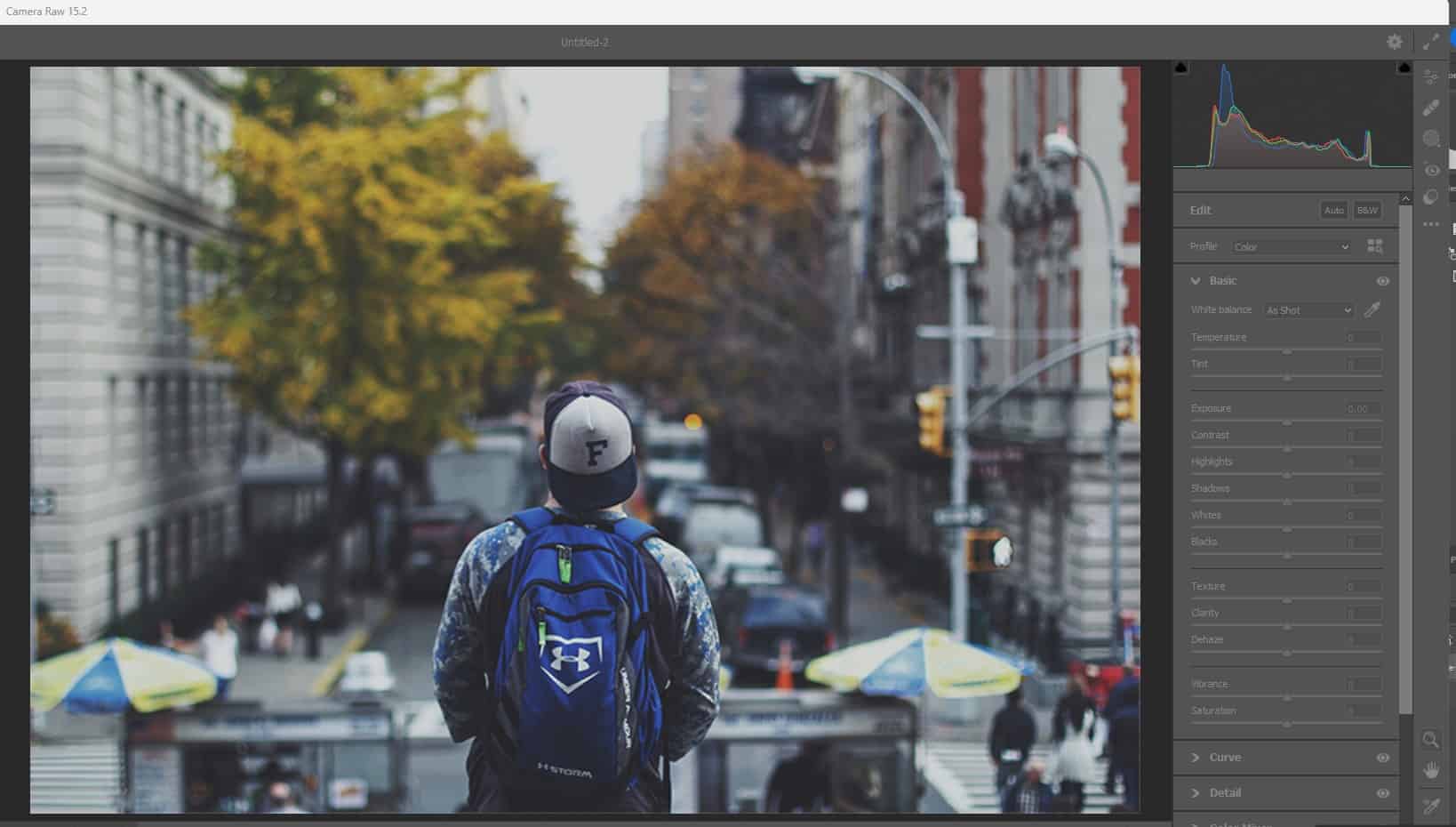
Lightroom Color Grading: A Guide
The “Color Grading panel” on Lightroom is a great place to start color grading. You’ll have many tools to tweak your photo and achieve your desired tone.
I recommend that you start with a raw file. It is better than working with a JPEG. Why? You’ll have much better flexibility for editing your photos.
Another reason to work with a raw file is the color information you’ll have.
In addition to getting more color information, another reason to consider using raw files is that you can set the “white balance” as if you had set it before capturing the photo.
In the photos below, you can see the before and after. That is the work of color grading. You can see how much the photo has improved and looks more appealing.
Compare the “before” and “after” of the below photos; which is a better quality? Of course, the “After” is.
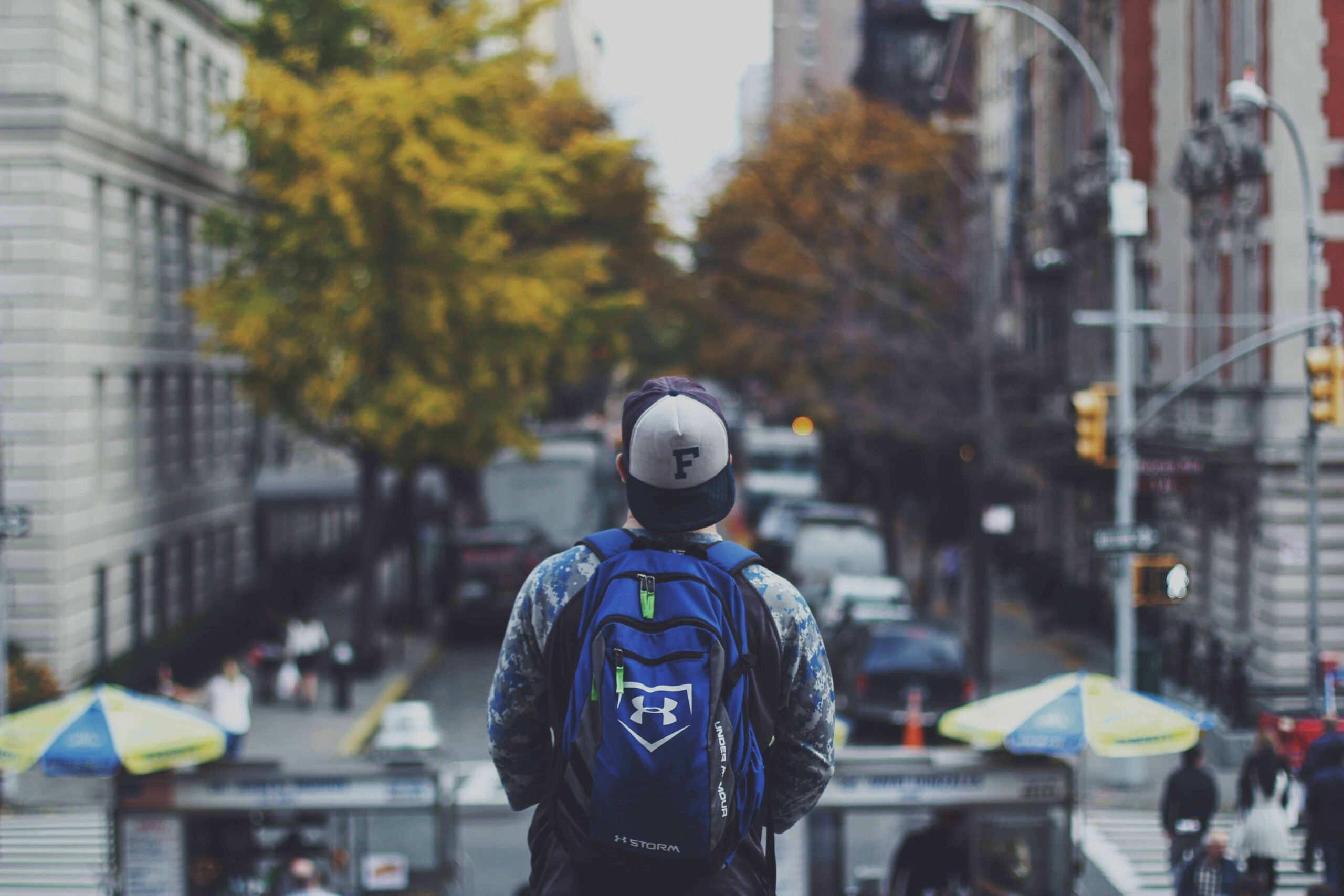
Before
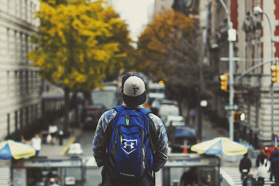
After
Alright, you have seen the two photos. But how did we arrive here? In the next stage, we’ll discuss the steps we took.
Remember, once again, we’re using a Lightroom color grading panel.
So, if you’re ready, let’s dive in.
Step 1: Fixing the color casts:
The first step is to correct the color. We have already discussed the difference between color correction and grading, and we said color correction comes before grading.
So, let’s start with the color correction. Select the “White Balance eyedropper tool.” You’ll find it in the Develop Module Basic panel.
Once you get hold of this tool, click on a neutral point.
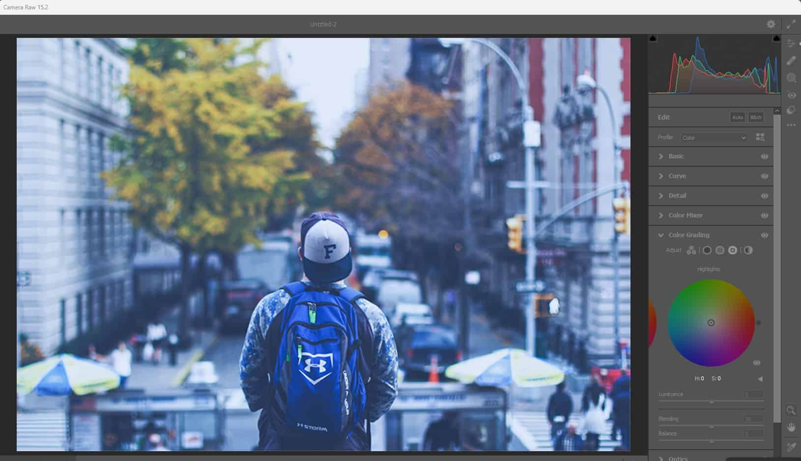
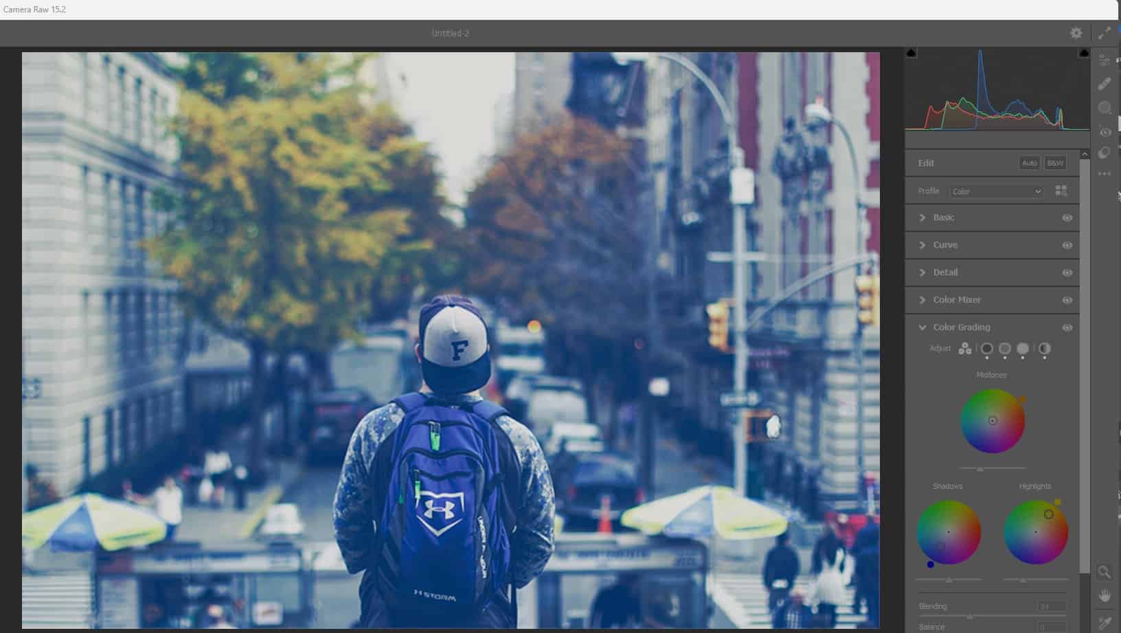
Step 2: Color grading wheels:
Go to the “Color Grading Panel.” It’s on your right-hand side. You’ll find icons at the upper part of this panel, allowing you to show diverse color wheel views.
For example, you can view shadows, highlights, or midtones colors. Or, you can see all three simultaneously.
Step 3: Tinting the shadows:
In this stage, focus on the Shadows color wheel. Remember we mentioned three (Shadows, Highlights, and Midtones). However, it would help if you started with the “Shadows” color wheel.
To tint the Shadows, here’s what you have to do: drag the point around the color wheel.
The point’s circular position will determine the chosen color’s hue. On the other hand, the distance from the center will set the saturation.
You can also reset and keep trying. Just double-click on the wheel, and everything will go back to normal.
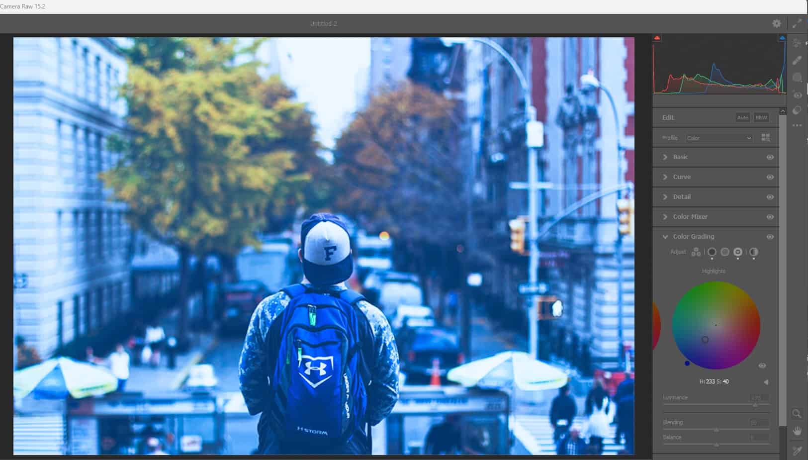
Step 4: Adjusting photo brightness:
It is possible to fine-tune the brightness of midtones, highlights and shadows. The Luminance slider located below the wheel can do this.
In this stage, another unique thing we did was to lift the shadows slightly. The idea was to make the photo’s blue color more pronounced.

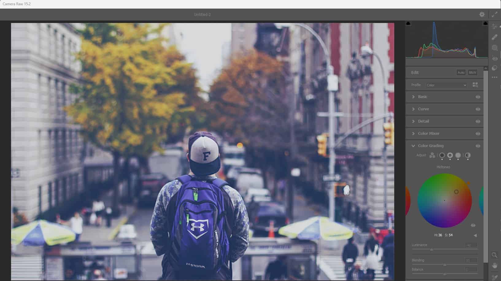
Step 5: Grade midtones and highlights:
Click the wheel’s edge (on the right). The idea is to switch to the midtones. You have to tint the highlights and midtones, but begin with the midtones.
You can tint whichever way you want. There is no perfect way. Tint until you achieve the desired result.
You can see what we did in the image below. To the midtones, we added a warm orange tint. But to the highlights, we added a subtle yellow.
Step 6: Get the blending and balance right:
We have reached a crucial stage. Here, you have to set the blending and balance right.
Firstly, switch to the 3-wheel view. Here, you can fine-tune the effect. The “Blending” slider is the next. It allows you to tweak or control how quickly the color changes from one form to another.
The “Balance slider” is also crucial. It shrinks or widens the portion of the affected tonal range. So, here’s what you’re going to do. Push it to the left-hand side, as this helps to shift the bias towards the shadows. For highlights, you can shift it to the right.
Step 7: Photo color graded:
You can see how stunning the photo looks. It has been color-graded. You can compare the “before” and “after” of the photo to see how much it has changed.
Conclusion
So, what is color grading in photography? We have defined what it means. In summary, color grading a photo is a unique way to set the tone.
With color grading, you can adjust the color to improve the quality of the photo and invoke a particular mood that suits the design idea or project you’re working on.
Several tools you can use for color grading exist. Examples include DaVinci Resolve, Adobe Lightroom, Adobe Photoshop, and others.
Furthermore, we also discussed the differences between color correction and color grading. Both are different terms and shouldn’t be used interchangeably.